Papermaster,
Your guide for expat
paperwork in Spain
The Problem
Spain is complicated for expats, paperwork-wise. There are a lot of steps to go through, and experiences can vary widely from case to case. As a result of my own personal experience with this process, I created an app to help people navigate these sensitive and complex situations. It is designed as a simple step-by-step guide listing items required for each stage and offering extra info and tips for further assistance.
MY ROLE
I was responsible for research, conceptualization, design, user validation, and delivery.
THE TIMELINE
This project was developed during 3 months.
THE TOOLS
Figma, Miro, Adobe Illustrator, Adobe Photoshop
Research & Discovery
I launched a survey in both Spanish and English to understand different experiences in both communities present in Spain, which were substantial. For example, the official Spanish government website listing the steps to the NIE process did not have an English version available. This radically changed the initial steps of the overall experience.
I reached out to the community via social media, WhatsApp groups, and word of mouth, and gathered neatly 150 answers in total.
60 English survey answers
89 Spanish survey answers
9 online user interviews
I also conducted interviews with expats, both English and Spanish speakers. I was able to speak to a group of 9 Spanish and non-Spanish speakers, with a mix of different backgrounds, expat veterans who had been living in Spain for years, and newly arrived NIE holders.
Insights
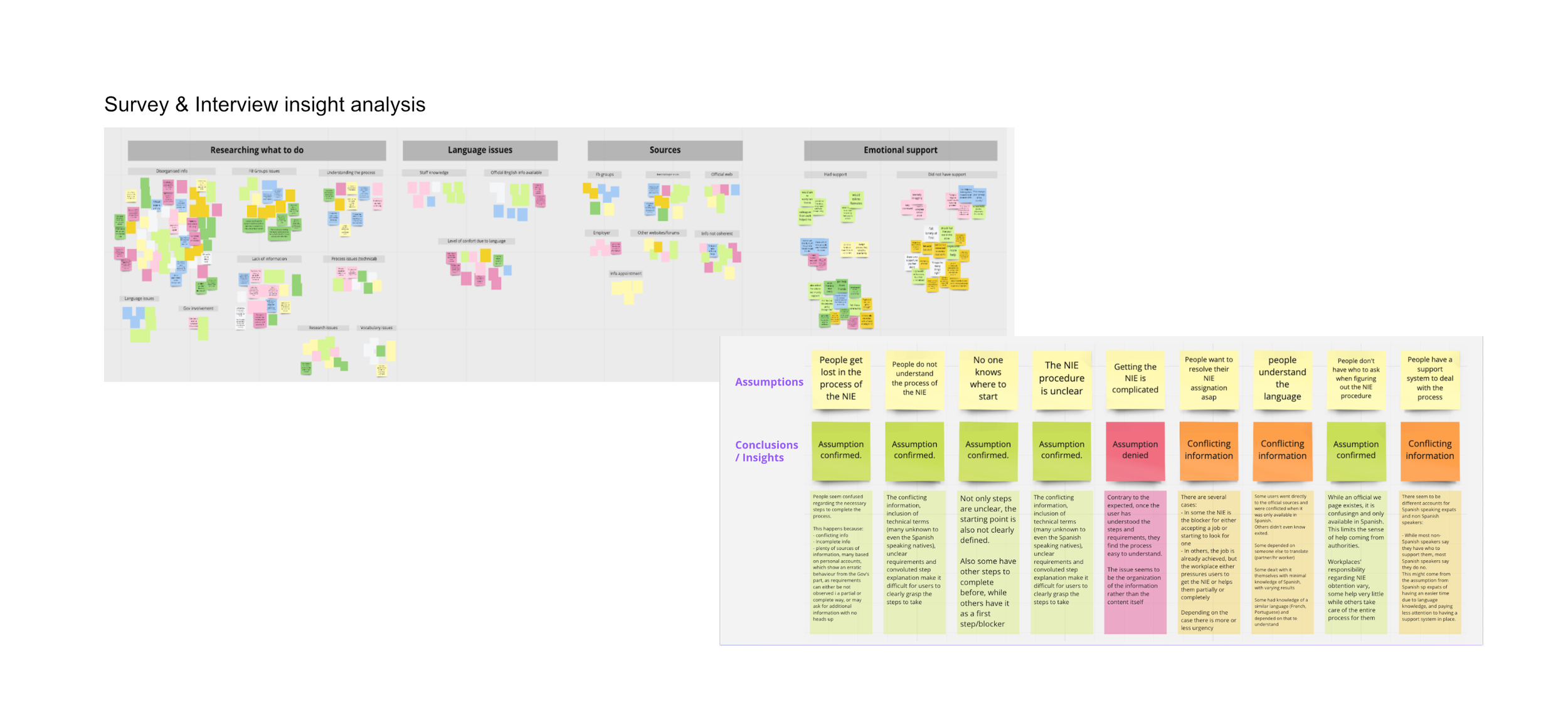
In terms of the most common pain points experienced during the NIE process, the main takeaways I managed to compile were:
Information sources were the problem, not the information itself. In the interviews, most stated that finding reliable sources of information was more challenging than the process itself.
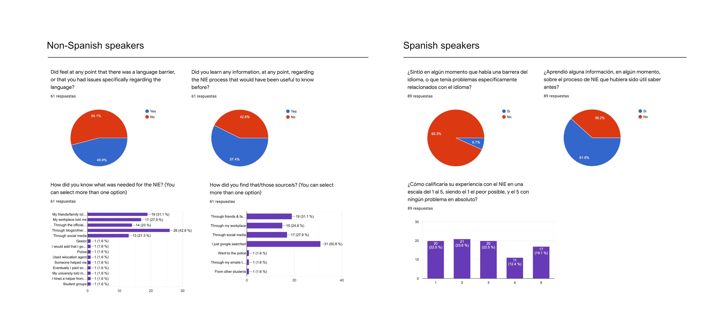
Access to emotional support varied by language. Over half of Spanish speakers (56%) felt alone or isolated. In contrast, 71,7% of non-Spanish speakers had some kind of emotional support during the NIE process.
Language knowledge made no impact. Not being fluent in Spanish was not a blocker according to the survey respondents (55% in non-Spanish speakers and 93% of interviewed Spanish native speakers), but it did limit them at certain stages. i.e., the Spanish government web page is solely in Spanish.
Inconsistencies about what came first, the job or the NIE. In some cases, the NIE was necessary to obtain a job, while in others it was the other way around. Why? It’s not clear. It might be due to changes in the official process, having local enabling connections, or having access to an HR department to speed up the process. It is also possible that it is related to inconsistent information from official sources and employees.
Learn about the entire process in this article on Medium.
Personas & User Journeys
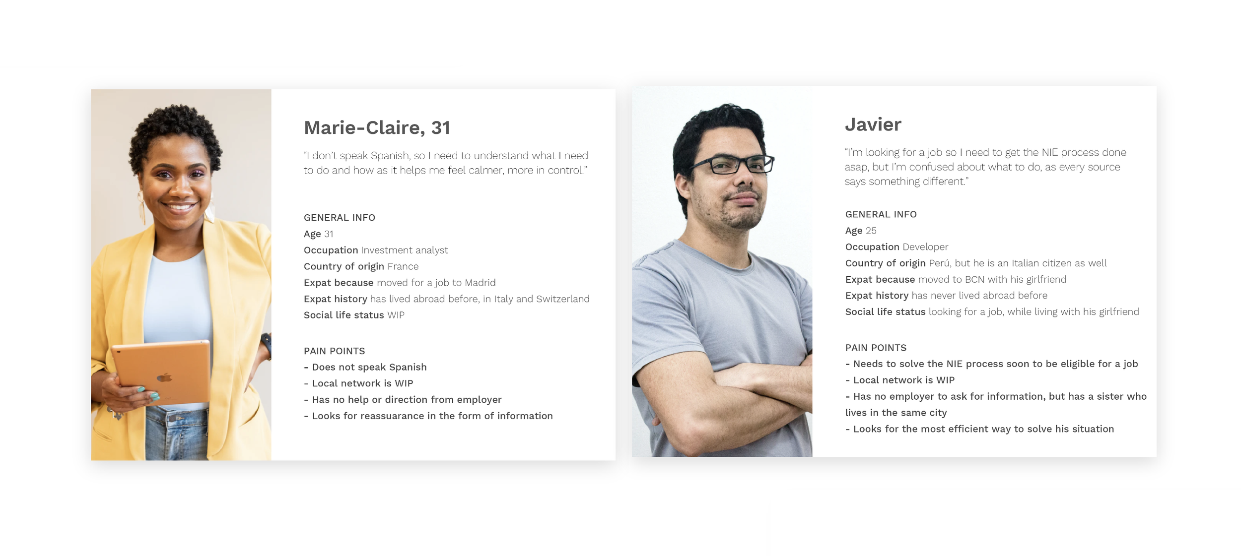
I started working on two different profiles that would have different sources available and would take different routes. In both cases, the user needed to have a clear idea of what had to happen throughout the process.
Marie: She had no understanding of the language, so she wanted reassurance and information. She could not use the official Spanish website, so she had to turn to other sources for research. She had a job, but no contacts. Also, she was informed that she had limited time to sort her paperwork before her job was at risk.
Javier: He had access to the official guides in Spanish, which made him confused due to the lack of clarity and conflicting information. His case was also time-sensitive, as he was looking for a job and would need the process to be done to get employment.
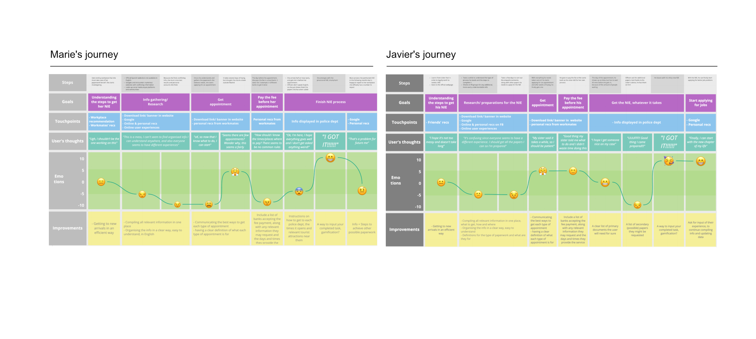
With both personas, I started working on a journey for each in search of clarity on their process.
In Marie-Claire’s case, she had a harder time researching on her own: her workplace did not help her with the NIE process, which set her up to start with a high level of frustration.
For Javier, there was a lot of information available, which was confusing and time-consuming. But he had friends who helped him understand what paperwork he needed and what was not required by official sources.
Flow & screen ideation
The aim was to get as simple a flow as possible in the form of a step-by-step process or similar.
The main issues here were:
Research had shown a lack of clear information. That would be my main goal.
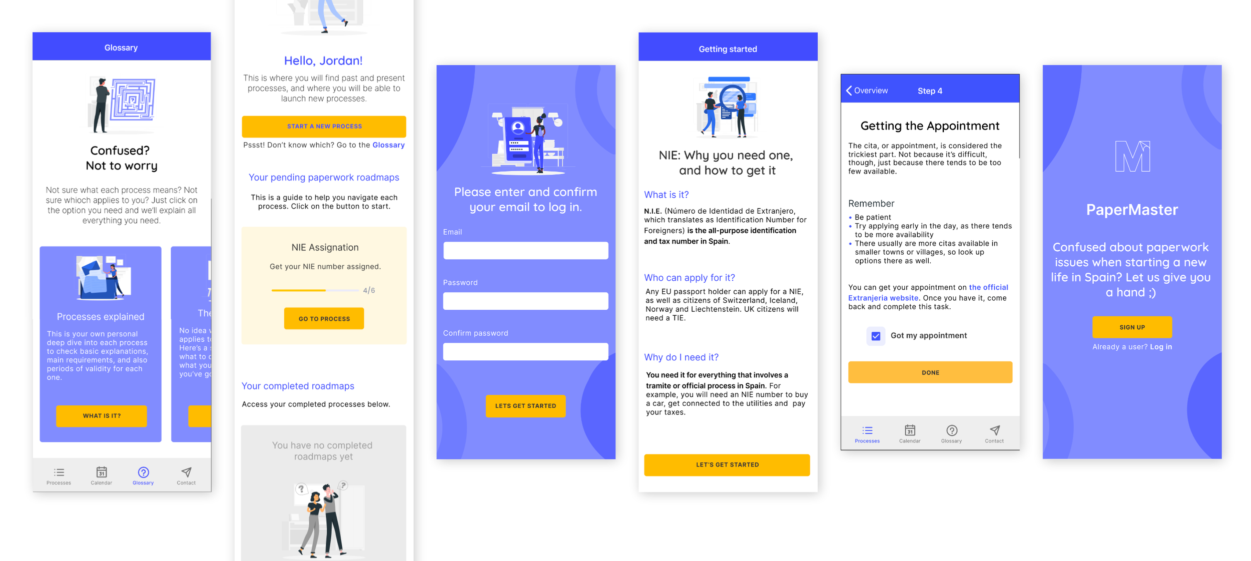
A Glossary that would cover specific terminology could also be of help. It had to be easy for new users to reach, but it couldn't be annoying for recurring users.
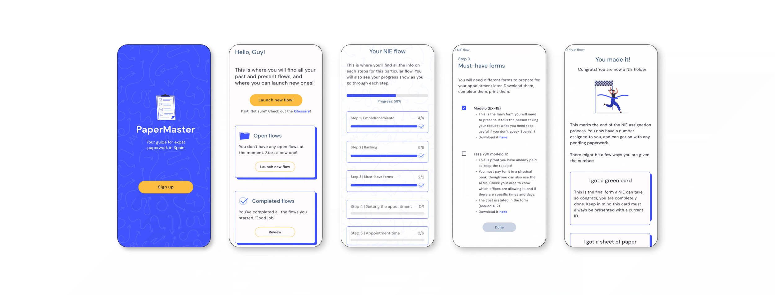
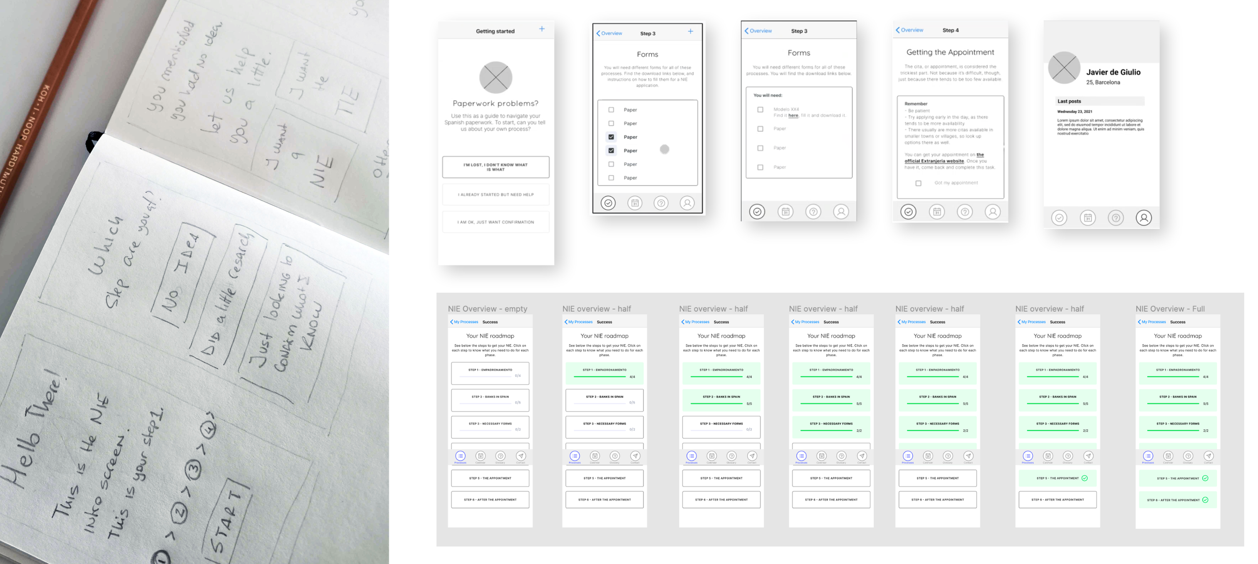
As a basic structure, I kept it simple and opted for a to-do list structure, breaking up the process into steps. This would serve as a way to organize the user and serve as a reminder for needed items later.
The flow changed several times, but it ended up including a dashboard as the main hub for all ongoing or completed paperwork, which allowed access to a process overview screen with a general status.
In terms of wireframes, they developed along with the user flow, making sure it was understandable to the users via testing. This was key since I got several instances in which users got lost and lost focus due to the amount of text present.
This also made clear to me the importance of UX copywriting, as each button, each paragraph had to be well thought out. As the app is informative, this was one of the major issues I had.
User Testing
I started testing as soon as I had the copy in the prototype. Some of the most helpful changes were:
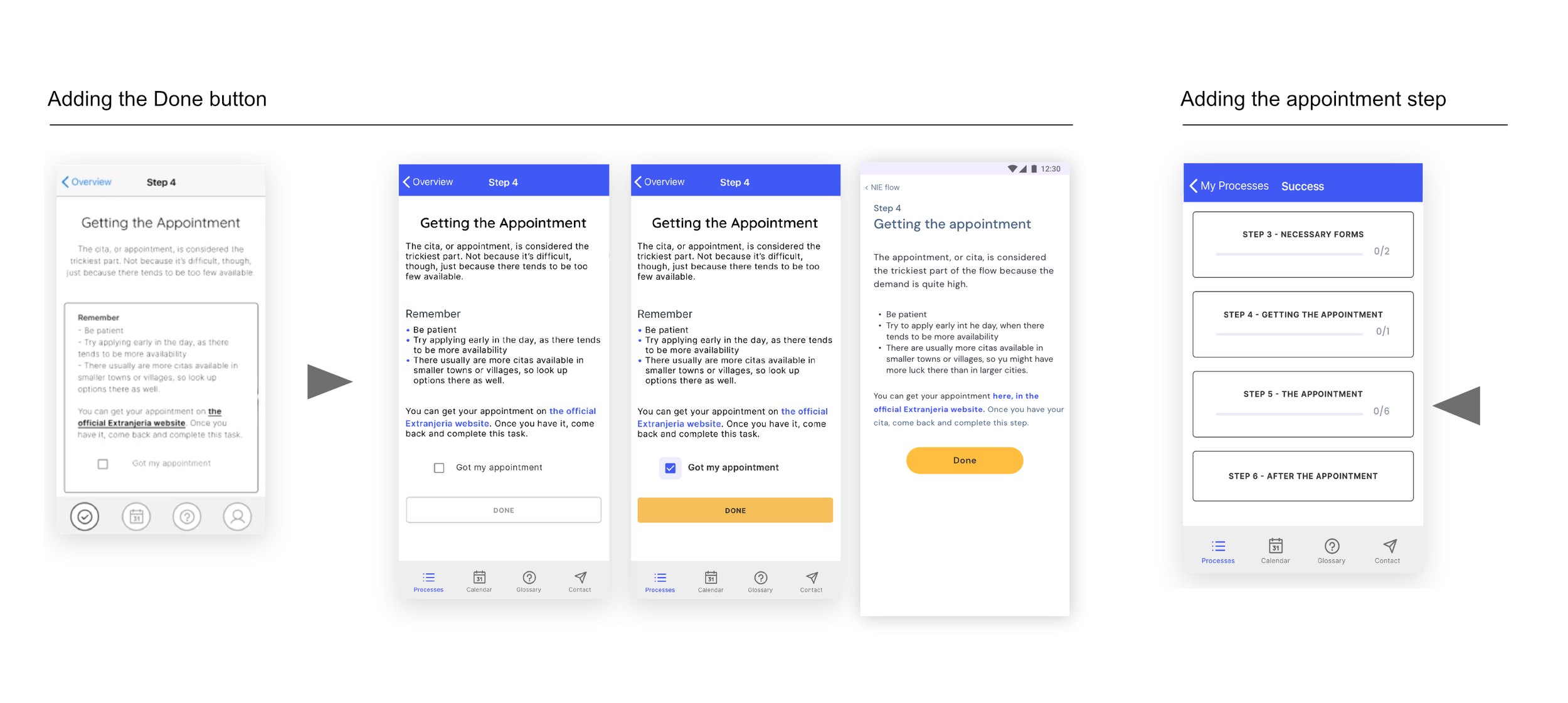
The DONE button: In an earlier version of each step, the user was intended to swipe back to the overview once the task was completed. Users stated that they felt the task had not been completed properly. They already knew that action would take them back and that it could be triggered at any moment, no matter the task status. A solution was to include a button at the bottom of the screen that would activate once the task could be marked as completed. This made clear to users what to do and added a bit of gamification.
Adding the Appointment step: In the first versions, when dividing the total process into steps, I originally just included tasks that would happen within the actual product. This left out IRL ('In Real Life') events, like the actual appointment in case of an NIE process. The idea was to just organize the user for them to complete the required tasks. Upon testing, feedback from the user mentioned that the lack of that step in the app made them feel 'abandoned' when they needed the support the most. So I added the appointment step, including a summary and checklist of the required paperwork, and additional paperwork that could come in
Final thoughts
During this process, it became very clear to me that design can be a very tangible way to improve people’s experiences in key moments of their lives. Many of these can be simple, like giving users information they need when they need it.